Lightning Design System
Role
Product Designer
Platform
React · SLDS · Next.js · Live prototype
Users
DMV counter agents, supervisors, and operations staff
Duration
2 hours
Impact
Fully interactive SLDS prototype with real queue logic, modals, workflow steps, and responsive layout
This is a 2-hour rapid prototype, not a months-long project. The goal was to demonstrate SLDS fluency end-to-end: pick a real domain, build a working console using actual Salesforce Lightning components, wire up live state and workflow logic, and ship it. The result is a fully interactive DMV ticket-processing system that runs in the browser.
Lightning Design System 2
Two hours. One brief: prove SLDS fluency end-to-end.
A DMV ticket console — complex enough to be real.
The challenge was simple: pick a real-world enterprise domain, build a fully interactive console using Salesforce Lightning Design System React components, wire up genuine workflow logic, and ship it. No Figma mockups. No placeholder data. No fake interactions.
I chose a DMV ticket-processing workflow because it has exactly the complexity enterprise tools need to handle: queues, case states, document tracking, exception handling, and supervisor escalation — all in one view.
“I wanted to prove that SLDS fluency is not just about visual polish — it is about building something that actually works.”
— Akhil Vanga, on the prototype brief2h
Time from blank file to live, responsive, interactive prototype
10+
SLDS React components used: Modal, DataTable, Card, ProgressBar, Badge and more
3
Live workflow views: queue management, case processing, and supervisor review
0
Figma frames used — designed and built entirely in code in the browser
Queue management, case verification, supervisor review — all live.
Queue logic. Case states. Live modals. All wired up.
The demo is a stateful React application using real SLDS components: PageHeader, Card, DataTable, Modal, ProgressBar, Checkbox, RadioGroup, Breadcrumb, and Badge — all from the @salesforce/design-system-react package with the official SLDS stylesheet.
Ticket data is live in state. Queue pagination is real. Workflow step indicators update dynamically based on what the agent has checked. Missing documents block step progression. Supervisor and reschedule modals open with live ticket context. The entire flow mirrors how an actual DMV operations console would behave.
01
SLDS fluency means using components correctly, not just visually
Using the right component variant, the right semantic token, and the right spacing class is what separates an SLDS implementation from a rough approximation of one.
“It is easy to make something look like SLDS. It is harder to make it behave like SLDS.”
02
Real logic makes the design problem real
Wiring up actual state transitions — missing documents blocking step 2, confirmations unlocking compliance, queue pagination with live row switching — forced design decisions that a static mockup would have let me avoid.
“Prototypes that actually work reveal problems that wireframes never will.”
03
Information hierarchy is the most important decision in enterprise UI
In a case-processing console, the difference between a tool agents use confidently and one they ignore is how fast they can find what matters. Hierarchy is not aesthetic — it is functional.
“Structure is not decoration. It is the product.”
01
I can work inside a system without losing product judgment
This example shows how I interpret a design system, understand its intent, and apply it in a way that still feels appropriate for the product and the user.
System fluency: The system structure translates directly into a working case-processing layout with clear hierarchy.
Designed and built in a single session.
I started with information architecture: what does a counter agent need to see at a glance, and what needs to be one level deeper? From there I designed the layout in code using SLDS grid utilities and component composition — no external mockup tool.
Every iteration was live in the browser. I worked through hierarchy, spacing, card grouping, step indicators, responsive breakpoints, and mobile alignment iteratively, validating in real time.
01
Information Architecture First
I mapped the DMV counter agent's core tasks: serve a ticket, verify documents, handle exceptions, escalate if needed. That drove the layout hierarchy before any component was chosen.
02
Live SLDS Component Assembly
I built the page structure using PageHeader, Card, and SLDS grid utilities, then layered in DataTable for the queue, ProgressBar for workflow tracking, and Modal for queue switching and supervisor review.
03
Stateful Workflow Logic
I wired up real React state: ticket selection, document verification progression, step badge logic, modal open/close with live ticket context, and queue pagination with active row tracking.
04
Responsive and Visual Polish
I iterated on spacing, typography, mobile breakpoints, badge hierarchy, and interaction clarity in the browser until the console felt like real enterprise software across all screen sizes.
Every decision had a real reason.
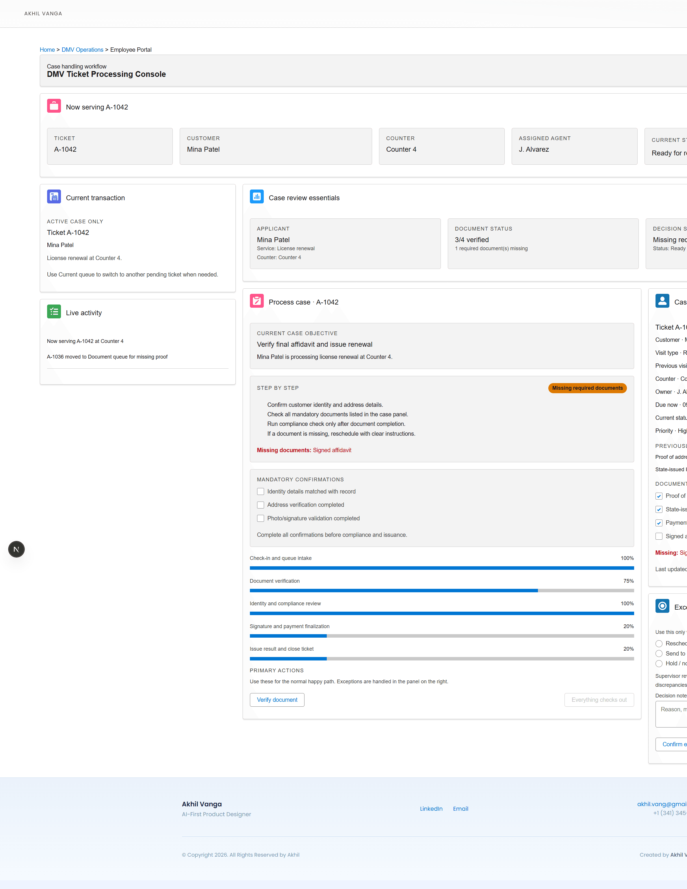
The step-by-step workflow panel shows dynamic status badges per step — Done, In progress, Missing docs, Pending — tied directly to document state and confirmation checkboxes. This was a deliberate choice to make the agent's current position in the workflow immediately legible.
The case history panel uses a label/value metadata grid rather than a flat list of paragraphs, because information hierarchy is the difference between a tool people trust and one they avoid.
Structure before components
Before choosing a single SLDS component, I mapped the information hierarchy. What does the agent need at the top level? What can be one click deeper?
That decision determined the two-column layout, the KPI tile bar at the top, and the split between the process panel and the case history panel.
Impact
The hierarchy makes the console scannable in under three seconds — critical for time-pressured counter agents.
Live case overview: information hierarchy, KPI tiles, and action routing aligned to SLDS patterns.
Dynamic step indicators tied to real state
Each step in the workflow panel shows a live badge: Done, In progress, Missing docs, or Pending — driven by actual checkbox state and document verification count, not hardcoded values.
This forced me to think about the exact completion condition for each step and make them visible to the agent without adding cognitive load.
Impact
Agents know exactly where they are in the workflow without reading instructions or switching screens.
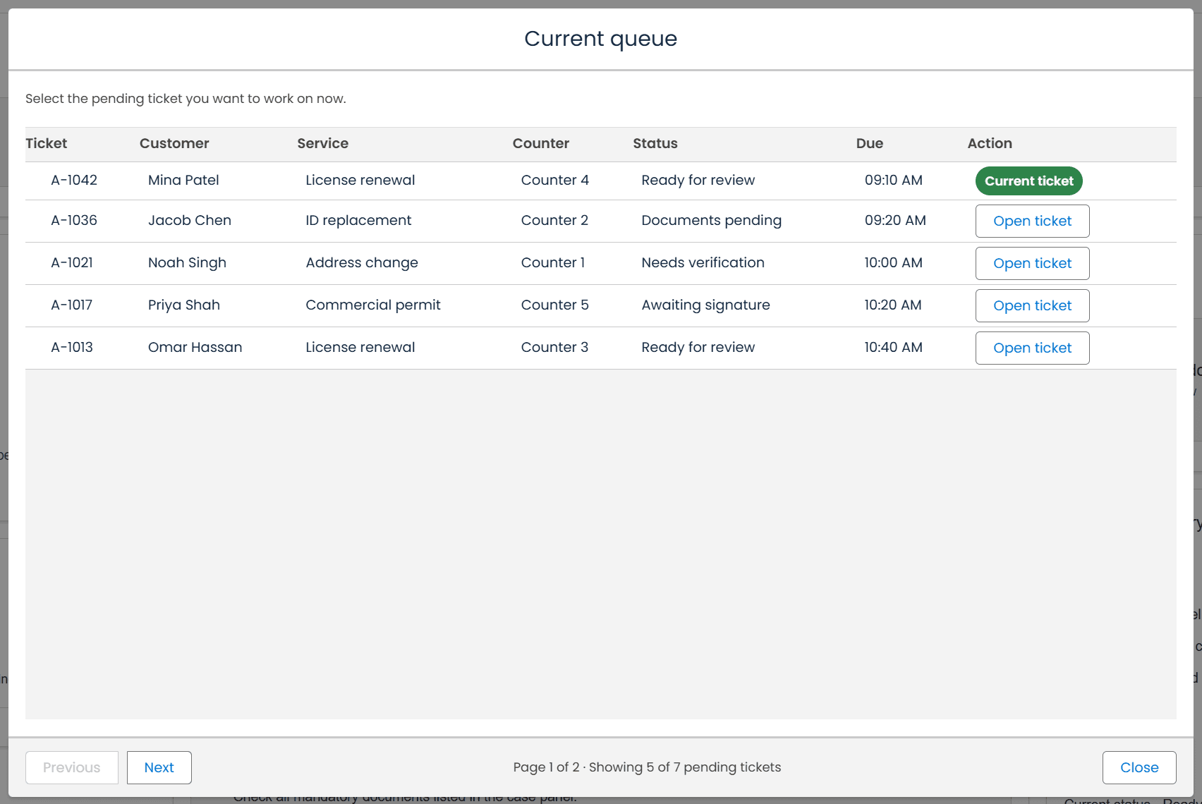
Queue modal: reusable container, consistent action grouping, and data-table interaction in one repeatable pattern.
Label/value grid over flat paragraph list
The original case history card was a flat list of paragraphs. It was impossible to scan. I replaced it with a structured metadata grid where labels and values are in clear columns with separator lines.
A small change in information format had a large impact on how fast a counter agent can confirm customer identity, visit history, and document status.
Impact
The panel now reads like a structured record, not a block of text — which is exactly what enterprise tools need.
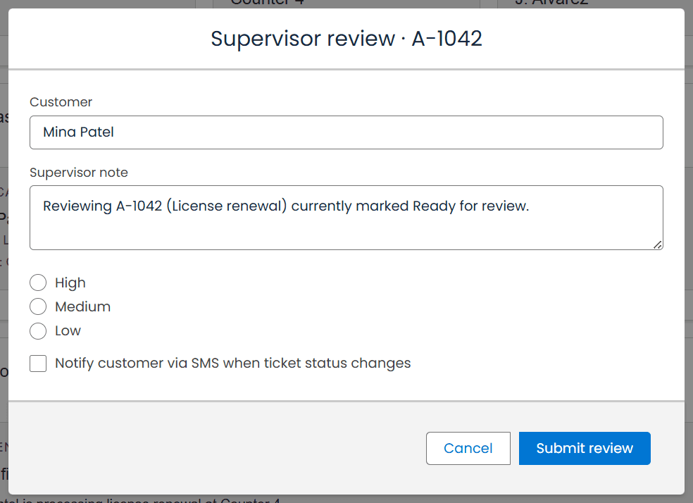
Supervisor review modal: form readability, control spacing, and clear submit/cancel actions under modal constraints.
Self-imposed rules that kept the work honest.
No external images. No placeholder components. No bypassing SLDS rules. Every component had to be a real SLDS React component used correctly. Spacing had to follow 8px rhythm. Colors had to be SLDS semantic tokens. If SLDS does not support it natively, it had to be built with plain CSS scoped to the demo shell.
Real SLDS only
Every component had to be from the @salesforce/design-system-react package. No custom component wrappers pretending to be SLDS.
Live state, no mocks
All ticket data, queue state, document verification progress, and modal context had to be real React state — no hardcoded UI illusions.
8px spacing rhythm
All spacing had to follow SLDS utility class increments. No arbitrary pixel values outside the system.
Responsive from day one
The layout had to work on mobile, iPad, and desktop without breaking component behavior or creating horizontal overflow.
2h
Total time to build a fully interactive, responsive SLDS console from scratch
10+
Real SLDS React components wired with live state and real workflow logic
3
Working modals: queue switcher, reschedule case, and supervisor review
0
Static mockups — every interaction works in the browser right now